A beginner's guide to creating high-bit pixel art character designs
What is Hi-Bit Pixel Art?
“Pixel art is a form of digital art created through the use of software that manipulates images at the pixel level. The aesthetics of this type of graphics come from 8-bit, 16-bit, and 32-bit computer and video game consoles, in addition to other limited systems such as graphing calculators. For most pixel art, the color palette used is extremely limited in size, with some pixel art styles using only two colors.”
Today these restrictions do not apply. This is because modern computers and video game consoles can handle terabytes of data on the fly. The result of this is the evolution of pixel art into a stylistic choice rather than a requirement to match performance.
The lack of borders now means that sprites - typically used to refer to pixel art images used as assets in games - can be larger, have more color, and represent more information at once. Over time, a division has emerged between the old style of pixel art and the more modern freeform style, appropriately referred to as traditional pixel art and hi-bit pixel art, in that order.
Today's pixel art design is heavily inspired by Super Nintendo Entertainment System (SNES) video games. There may be many reasons for this, but the biggest of them seems to me to be the nostalgia it evokes in people who grew up playing these games in the XNUMX's.
"I think any pixel art game that works beyond the limitations of the old 8/16/32-bit consoles can be defined as hi-bit."
This means that while we have the option to throw all the rules out the window, the appeal of pixel art lies in connecting with an audience that grew up consuming media that was largely pixelated.
As an artist looking to use pixel art to design characters and assets for an upcoming project, this freedom can lead to stylistic conflicts, often between maintaining the limitations of the SNES era or treating pixel art like any other modern form of digital Art without restrictions. Questions like:
- How many pixels can we use?
- How many colors will we use?
- How is the shading done?
- Do we want realism or caricature?
- Do we need outlines for our sprites?
Can come.
My Rules for Hi-Bit Pixel Art
In general, a lack of rules can baffle even experienced performers. So I like to choose a reasonable center point for hi-bit pixel graphics. I can do this by establishing a few ground rules:
- No sprites or character graphics may be larger than 100 pixels
This is a rule that indie and solo developers and artists should follow, especially for animated pixel art designs. Large pixel art sizes can be difficult to animate within a reasonable time frame, especially as a one or two person team. Setting realistic sizes for your sprites will save you time animating characters and redrawing characters and assets in the future. 100 pixels is plenty of room for any character sprite, even for the most ambitious artist.
- Less is more
It is important to present as much information as simply as possible. If you feel like a character isn't working, it may be due to over-rendering. Over-rendering simply means using too many colors and shapes in an object until the detail is subtracted from the overall image. Elements such as shadows, highlights, highlights, dirt, scratches, and cracks can be powerful visual queues to drive a story through your art, provided they are used in an appropriate manner.
- Exaggeration sums it up
The limited number of pixels restricts posing and animation. Instead of enlarging the sprite, why not exaggerate a bit to get the point across? Resize the sprite to its actual screen size to see if the pose/action gets the point across.
- maintaining visual consistency
With a large sprite size, it's difficult to maintain the same level of attention to detail throughout the sprite. It's easier to make mistakes like inconsistent lighting techniques, inconsistent color schemes (unless you use a palette), and anatomical errors when creating characters. Be patient, take breaks, and turn your canvas often to see your art from a different perspective. This allows you to catch your mistakes early and maintain consistency.
How to Design Hi-Bit Pixel Art Characters.
Now that we have some rules for Hi-Bit Pixel Art design, let's see how we can create an original character, using the rules we have set for ourselves to guide our drawing decisions to direct. I am currently working on a game with animals as my characters. I want the animals to be cute and have colors that contrast and pop. I want information through the colors of their clothes, their species, their personality, etc.
1. Choosing the right reference
Art references are like a retake before an exam. They determine the artistic choices, concepts, colors and boundaries of our work. That's easy, because this is where my references are defined. Pictures of animals in zoos from the internet or your phone gallery would be a good place to start. More importantly, having art that shares the same themes or styles helps me visualize my vision more clearly. For example, my reference board would include games like Ratchet & Clank and Crash Bandicoot, popular movies like Zootopia, Life of Pets, and Madagascar. All of these sources correspond to a stylized animal-themed world with multiple characters and design ideas.
2. Creating a strong, recognizable silhouette
Every good design starts with finding a simple, strong silhouette for your character. This would mean nailing down the details of your character. are they human Are you male or female? Strong or weak? Intelligent? what is her role This should help you make your decisions, e.g. B. the proportions of the figure, its basic forms and its accessories.
For the example below, my base description was:
“A neutral character that should be personable and expressive to respond positively/negatively to player actions. The character will run, jump and slide, so must be fit and slim. Must be stylized and cute but look like they're in high school."
With that, I outlined our character's stature, mood, and composition. When that's done I can start hiding the silhouette for this character.
This part is very similar to sculpting. I always start with a color furthest from what I think the final character will be. This is to stay focused on the shape of the character. This may take some time as you will find the primary forms that determine your character's appearance and style. I find it useful to engage in happy mistakes that can lead to pleasant and surprising results.
![]()
You'll know you've done enough when you see that the silhouette represents the correct proportions for your character. The character proportions in this case do not correspond to normal human anatomy. This character has oversized feet and a really big head, but still feels natural, which is a good balance when trying to draw cartoons and caricatures.
In this case, I tried to use the character's mouth, head shape, and ears to make her silhouette unique. You will find that this may not be the final shape for your silhouette. Although I started out with it, I later felt that it was too stiff and lacked the power and confidence I was hoping to show in this character.
3. Define volume by shifting value
A character's volume determines what their shape would have been if rendered in 3D. The task here is to use the value to represent the shape of a 2D shape in 3D by defining how that object interacts with light and shadow. For example:

The example above has transformed the silhouette we worked on in the previous section into a volumetric object that we can believe has more than one dimension. This means that we can see which points of our character are closer or farther, rounder or flatter. A reassessment of character proportions is in order at this point. We can also start thinking about the character's outfit. Are you wearing a leather jacket or a t-shirt? This decision can be made by the character description that you set before starting this drawing.
This will help us look at our character from a more detailed perspective and see if the pose defined in the silhouette still holds up further in the drawing.
The values I chose to define my volume are the colors that appear before and after my current color in my palette. So I make sure to use a color that's central in the color range for the palette I'm using. If you are already using the darkest/lightest color, you can create a new swatch in your color picker in your software of choice.
I find working in monochrome prevents me from making premature decisions about which colors to use before the final form is defined.
4. Color
Color can be a complicated subject, but it can be greatly simplified using online palette creation platforms such as Adobe Color, Coolors, and Cowspec, to name a few. In addition, Aseprite, which I use (and recommend), comes with a number of palettes that can be useful for beginners with pixel art.
Understanding color and how it interacts with natural light can be a great skill to enhance your pixel art. The ability to identify complementary colors in a palette can help you decide what characters might look like. For example, rendering skin at higher resolutions can be complicated, but with pixel graphics this can be reduced to just two colors. Hi-bit pixel art aims to blend the two styles, where we use a limited set of colors to represent our neutral, highlight, and shadow values. Some styles can add two more values for Crease and Fringe Light.
Start by defining neutral values to affect the rest of the colors. For example:
![]()
The image above shows that 4 colors were used for the face. They may not match reality, but they are close enough to get the message across. The lip is a prominent feature for this character that I added in the previous step, as such. It works to be big and bright without necessarily drawing too much attention.
Make sure the colors for each section are contrasting enough to instantly tell the differences between each visual landmark in the design. Your character's shoes should be immediately distinguishable from your character's legs at first glance.
5. Details with highlights and shadows
At this point we are more or less done with the drawing. However, to achieve a higher level of detail in our drawings, we can add detail to the character's clothing and face based on how these different surfaces interact with the light.
The first step to proper detailing is to decide where your light is coming from. A light source helps to get consistent shadows at all times. While it's not necessary to have a visible light source in your drawing, marking the direction of the light on your canvas can act as a reminder to help you stay consistent.
Next we can use shadows and highlights to define the darker and lighter parts of our drawing to really emphasize the sense of depth. Shadows can be made in many ways and really deserve a discussion of their own. However, in the example below, I chose to use dithering to show that feeling of fading light and shadows in curved surfaces.
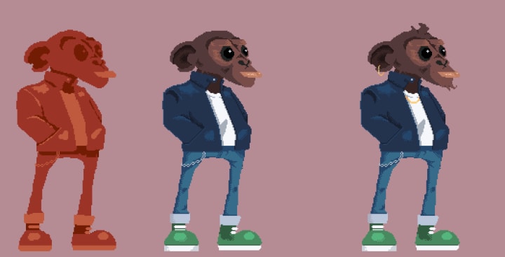
With bright colors like yellows and greens, defining accessories for your characters can really enhance their personality and their individuality. Necklaces and ears can show confidence and swagger in a character. This can also be done through the choice of hairstyles, including facial hair.
Conclusion
In this discussion we covered the following:
- What is hi-bit pixel art?
- Rules limiting the size and detail of art.
- The process of creating your first hi-bit pixel art character.
The beauty of this process is that it also allows for consistency across different characters that can be repeated over and over again. throughout a project, no matter what style you've chosen.